Simple branding tools to help you rep Cru the right way.
We get it, most students and volunteers don’t wake up thinking about logos and color codes. But when you’re putting together an event slide, social media post, or shirt design, having the right look helps people instantly recognize Cru. It builds trust, makes things feel connected, and just looks better.
Using the correct Cru logo, colors, and fonts shows that we’re part of something bigger—a global movement that’s all about helping students know Jesus.
Here’s the quick-and-easy version for when you just want the stuff and don’t want to dig:
Cru Logos
Your logo is often the first thing people see. Using the official Cru logo keeps your materials looking credible and connected to the bigger mission.
Download your Cru Logos Here!
Get more Logo options at cru.org/brand/logos.
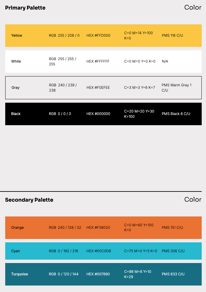
Cru Colors (Main color palette)
Cru’s colors aren’t random—they’re chosen to reflect who we are. Using them helps your flyers, slides, and social posts feel unmistakably Cru. For more options, be sure to check out the full color selection at cru.org/brand/color.
Cru Fonts
Fonts shape how your message feels. Stick with the Cru fonts to keep your materials clean, readable, and on-brand—without overthinking it. Our Cru Fonts are Sora and Inter. Click the name of the font to download it. Below are some basics of how to use them but you can learn more about how to match our brand at cru.org/brand/typography.